Определили ваш договор
Он заключён с ООО «Интернет Решения». Если есть другой договор, сможете переключиться на него в боковом меню
In the What to sell on Ozon → Category analytics section, you can:
Advanced analytics is available for sellers who already have an Ozon account.
Learn more about sales analytics
You can select only one metric for the report and compare from 2 to 10 categories. The report contains:
Set up filters and views of data depending on the information you want to analyze.
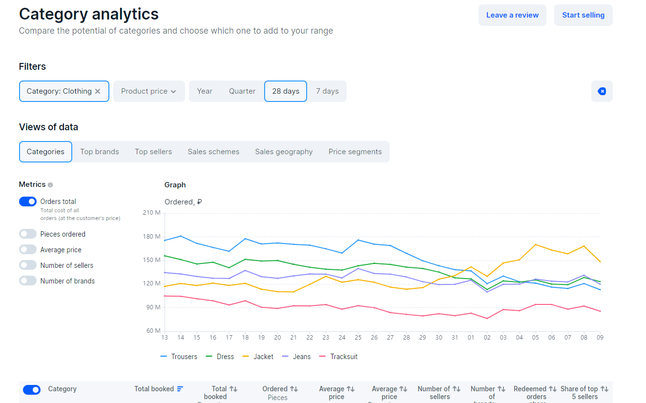
The set of metrics in the table depends on your settings.
| Metric | Meaning | Usage |
|---|---|---|
| Total booked, ₽ | Total product turnover. | Compare figures for categories, brands, and regions to decide where to supply products. |
| Total booked, dynamics, % | Change in turnover in relation to the previous period. For example, if you select a year period in filters, we show how the turnover has changed compared to the previous year. | Identify trends by category to choose the profitable category when getting started on Ozon. For example, if a category has low sales volume, but it has grown significantly over the past year, this tendency may maintain and the category may continue growing. |
| Ordered, pieces | Quantity of ordered products. | Estimate the demand for products in a specific category. |
| Average price, ₽ | Average selling price of a product. If you’ve sold 70 products for 1,000 RUB each and 30 more products for 1,500 RUB each, the average price is: (1,000 × 70 + 1,500 × 30) ÷ 100 = 1,150 RUB. | Calculate approximate income and expenses using our online calculator. |
| Average price, dynamics, % | Change in the average price in relation to the previous period. | Keep track of the change in average product price of this category over time. |
| Number of sellers | Number of sellers in a category. | Evaluate the level of competition and calculate the average turnover of a seller in the category. |
| Number of brands | Number of brands in a category. | Evaluate the monopoly level in the category. |
| Number of sales zones | Number of clusters where customers order products of a particular brand or seller. | Determine the geography of brand sales and plan supplies according to regional demand. |
| Share of top 5 sellers, % | The turnover percentage the top 5 category sellers hold. | Find out if customers trust new sellers or choose to buy from the leaders of the category. The lower the percentage, the higher the competition in the category and the more often customers buy products from different sellers. |
| Turnover share in a category | Percentage of the total cost of orders in the selected category relative to the overall total. You can view the percentage for a subcategory, brand, seller, scheme, or sales zone. |
Evaluate the demand for products of a certain subcategory and the level of competition in it. |
Set up filters and views of data.
Select up to 10 metrics you want to see on the graph.
To the left of the graph, select the comparison metric.
The graph displays the changes in metrics within the selected period.
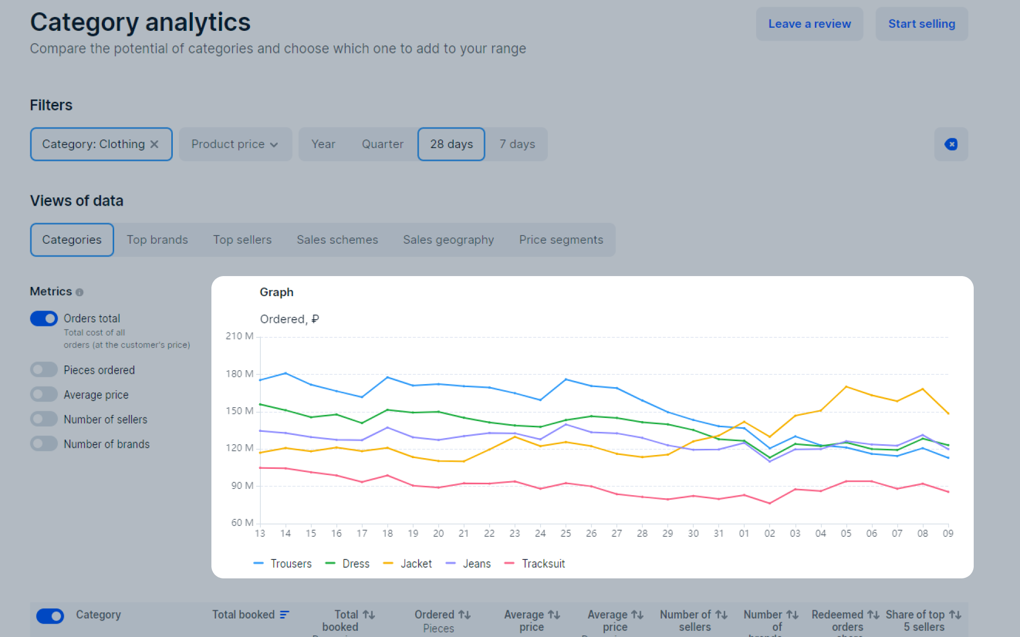
In the filters, select a level 2 category, for example, Casual Footwear, to determine the most profitable subcategory.
Select a period. If a category is seasonal, for example, it’s in demand only in autumn and winter, it’s better to view data for a year. Shorter periods are suitable for non-seasonal categories.
In the Views of data block, select Categories.
Create a graph using sorting to compare subcategories. To do this, you need the following metrics:
In the filters, select the level 2 or 3 category in which you plan to sell products.
Select a period.
In the Views of data block, select Top brands.
The table displays metrics for the 30 best-selling brands in the category. To compare brands, create a graph using metrics:
In the filters, select the level 2 or 3 category in which you plan to sell products.
Select a period. To view the current data, select 7 days, 28 days, or a quarter.
In the Views of data block, select:
We don’t show the store names, but you can view:
In the filters, select the level 2 or 3 category in which you plan to sell products.
Select a period.
In the View of data block, select Sales schemes.
In the table and on the graph, we display the turnover metrics and the number of sellers working under each scheme.
Learn more about sales schemes on Ozon
In the filters, select the level 2 or 3 category in which you plan to sell products.
Select a period.
In the Views of data block, select Sales geography.
In the table, we display data for all clusters where customers order products of the category. Make supplies to regions where products are sold more often, so logistics is cheaper and delivery is faster.
Hide menu
Show menu
Выберите договор

Это база знаний для продавцов из стран СНГ и дальнего зарубежья.
Если ваша компания зарегистрирована в России, перейдите в базу знаний для продавцов из России.
Когда вы зарегистрировались на Ozon?
Условия работы и инструкции зависят от даты заключения договора — её можно посмотреть в разделе Договоры
Определили ваш договор
Он заключён с ООО «Интернет Решения». Если есть другой договор, сможете переключиться на него в боковом меню