Определили ваш договор
Он заключён с ООО «Интернет Решения». Если есть другой договор, сможете переключиться на него в боковом меню
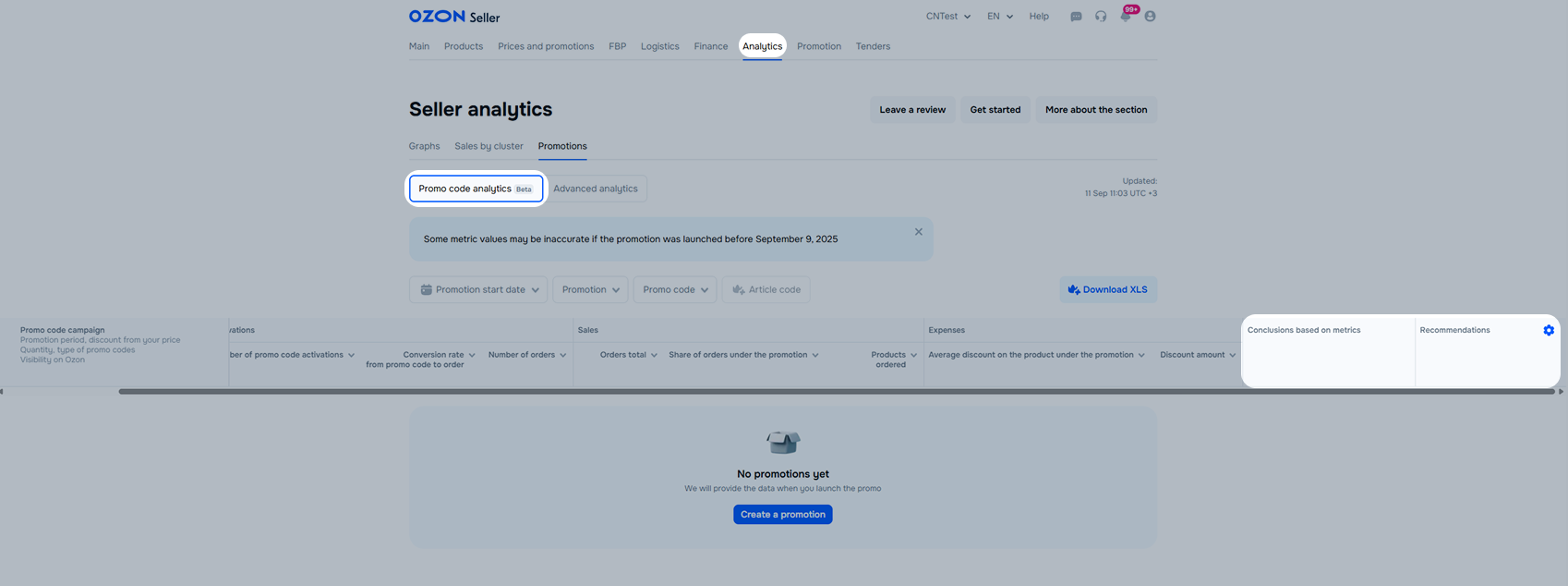
In the Analytics → Promotions section you can see how promotions affect the number of orders, earnings, and views and decide on further promotion, the choice of promotional mechanics, and the discount amounts.
The tool provides analytics on promotions with promo codes. Using it, you can:
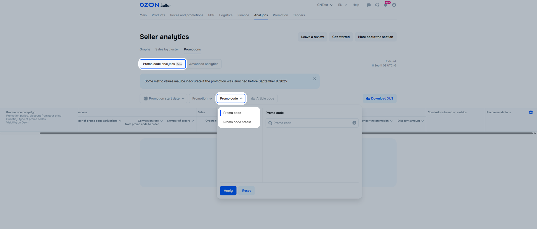
To view the analytics, open the Analytics → Promotions → Promo code analytics section.
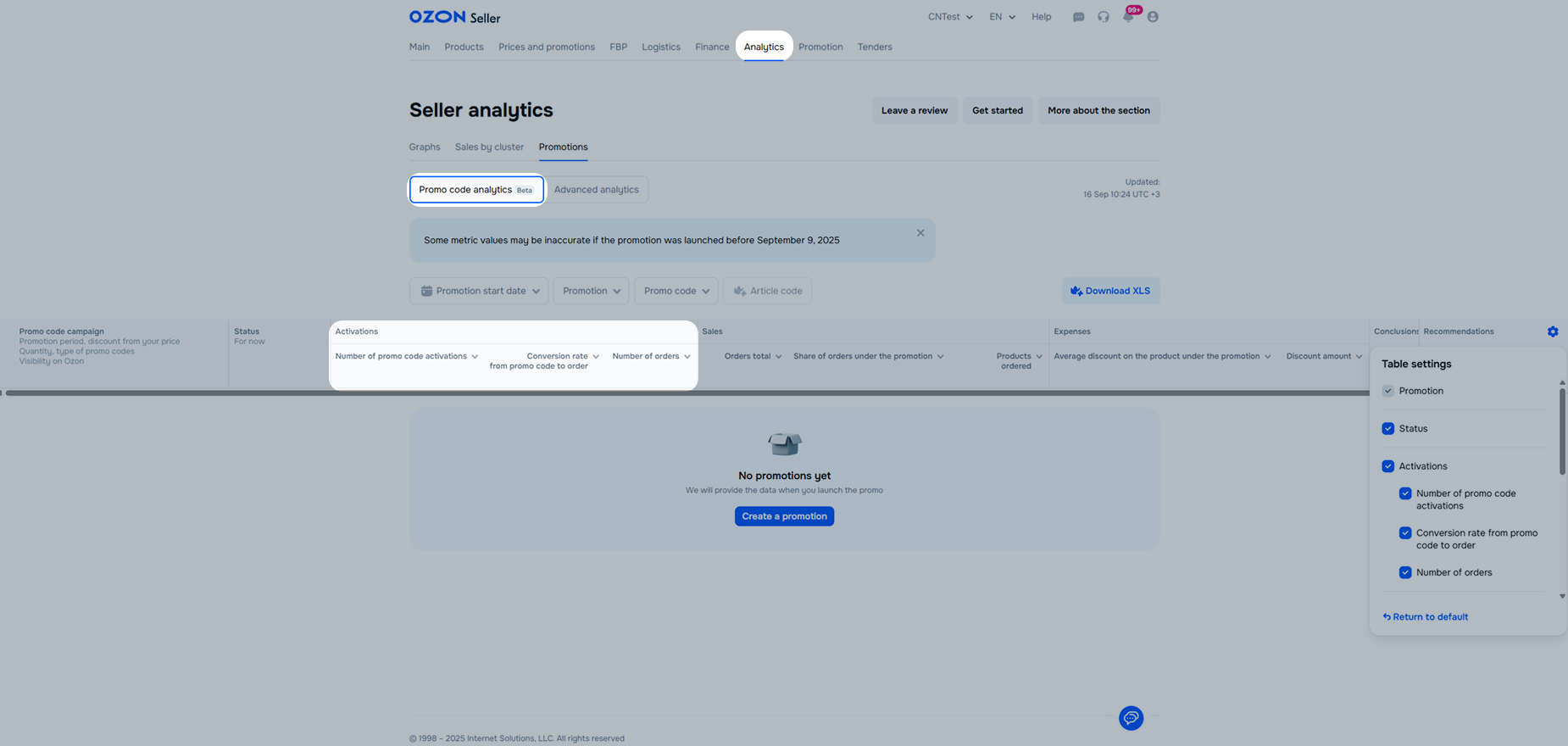
The table displays the data for products with activated promo codes:
Promotion information: name, duration, promo code visibility, quantity, and promo code type.
Promotion or promo code status.
Promo code activation analytics:
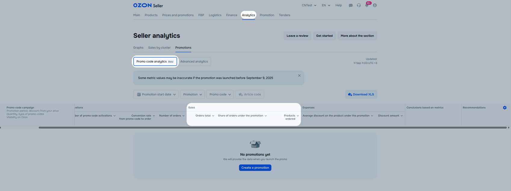
Sales analytics:
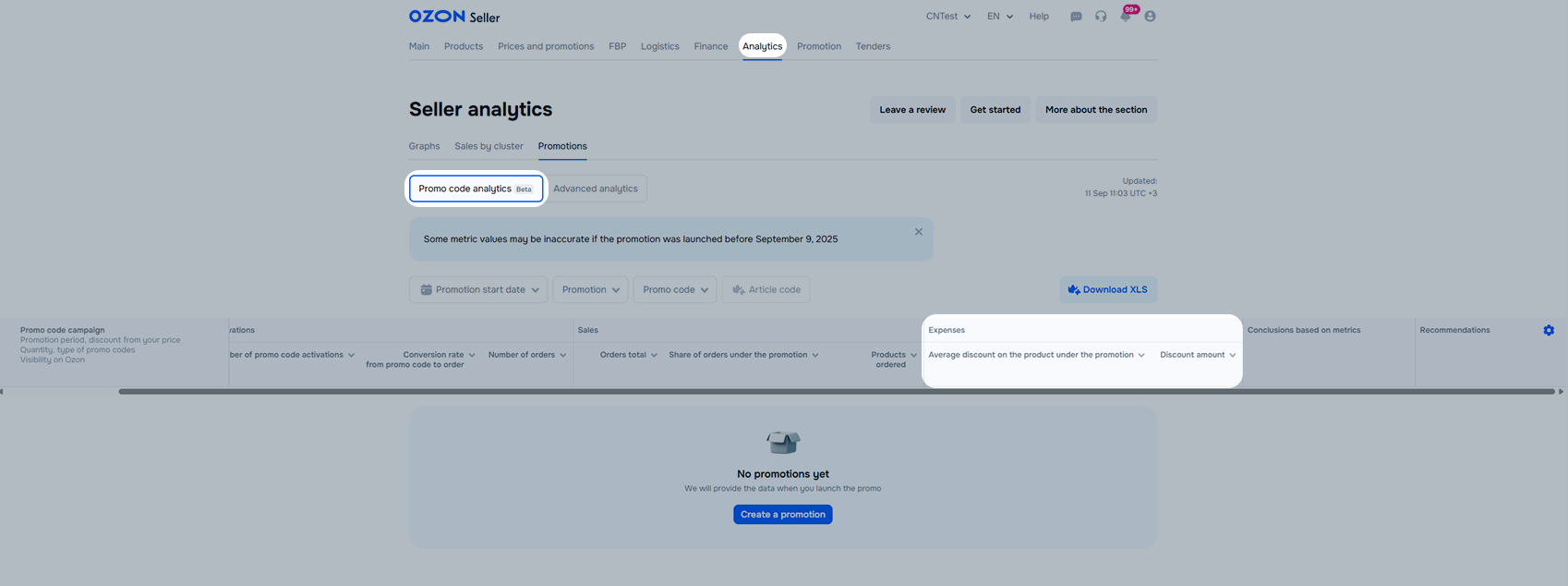
Expenses analytics:
Example
First, you sold 10 products with a 40% discount. Then the product discount dropped to 25% and you sold 5 more products. To calculate the average discount value:
We calculate the total discount for each case: multiply the discount by the number of products sold with it. Then we add up the received values.
40% × 10 + 25% × 5 = 525
We divide the resulting value by the product number sold in the promotion:
525 ÷ (10 + 5) = 35
Total: the average product discount for the promotion is 35%.
“Conclusions based on metrics” and “Recommendations”: we compare your promotion data with other sellers` promotion data, draw a conclusion about the effectiveness of the promotion, and give recommendations.
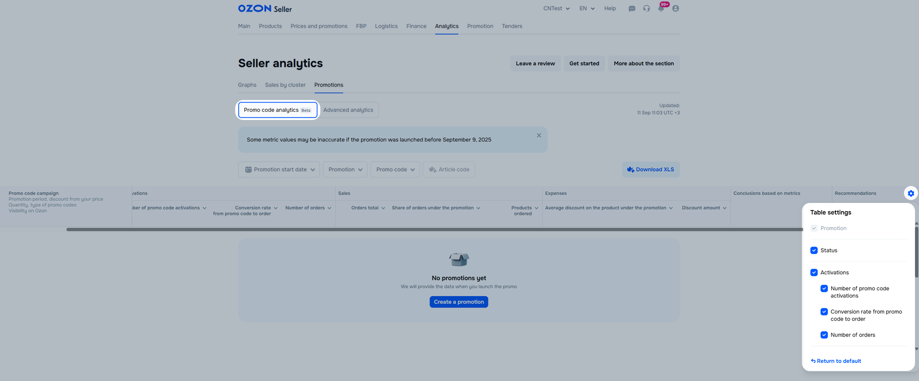
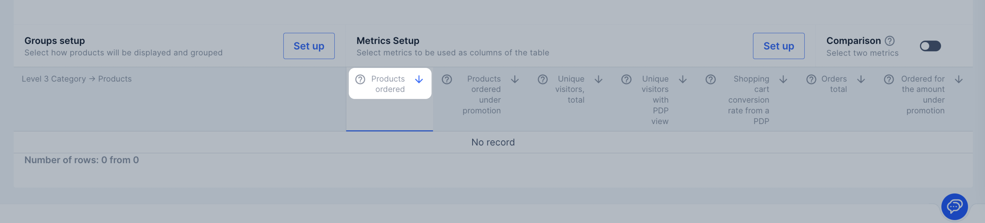
To set up the metrics display in the table, click
![]() and select the metrics.
and select the metrics.
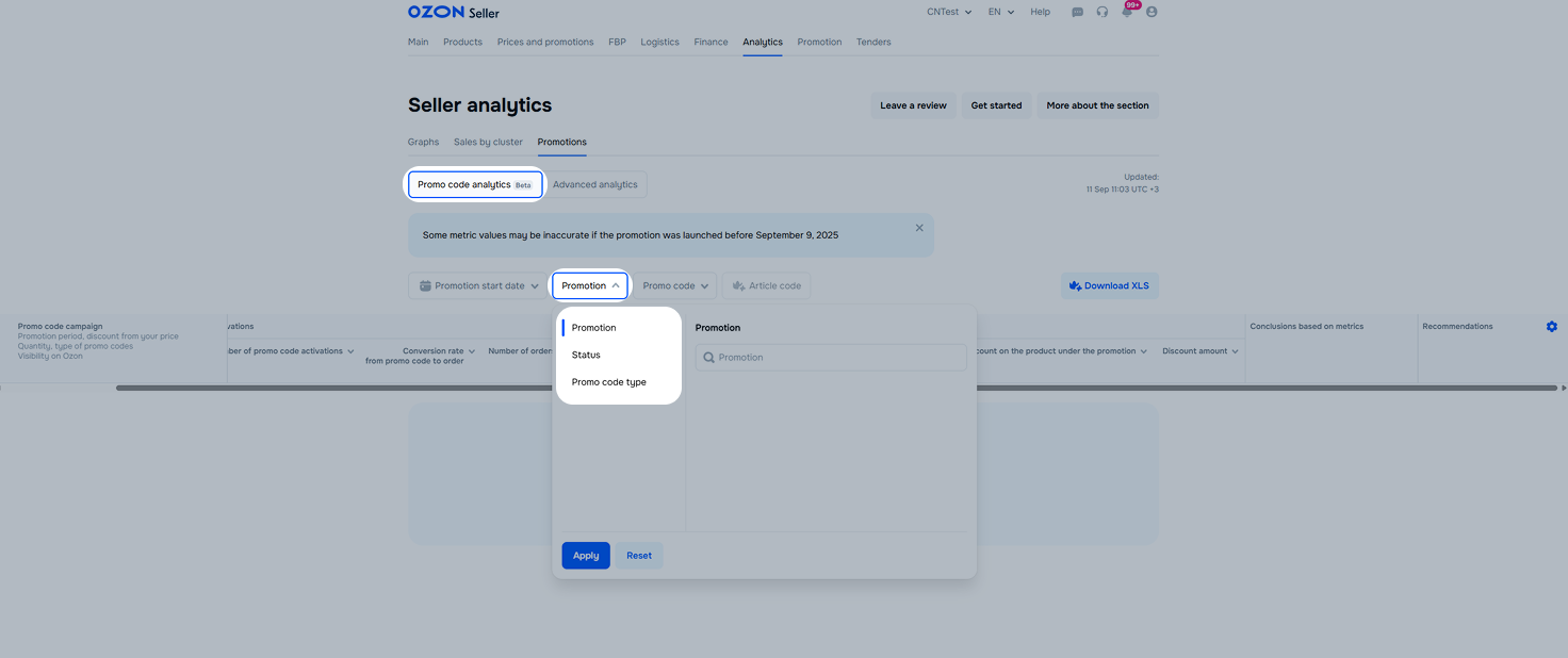
To view analytics for specific promotions, promo codes, or products, select them and sort the data with filters. Filters include several settings:
Promotion start date: select the promotion start date or period if it started on any day of the period.
Promotion:
Promo code: available to employees with the “Manager”, “Administrator”, or “Analyst” roles:
Employees without the “Manager”, “Administrator”, or “Analyst” roles can use the Promo code status filter to sort the table data by promo code status.
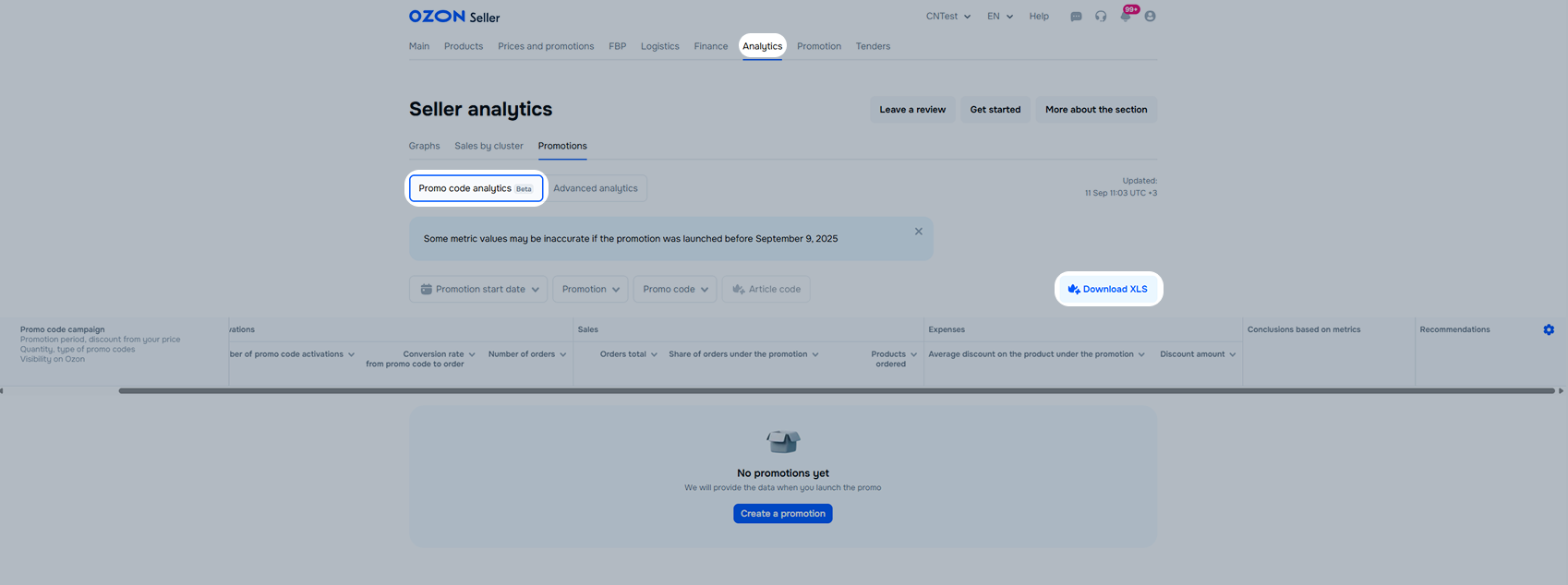
With the Premium Plus subscription, you can download promo code analytics in XLS report format. To do this, click Download XLS.
You can use the basic settings to analyze:
List of basic settings:
Report period—select any period for the sales report: for today, yesterday, week, month, or quarter.
Filters:
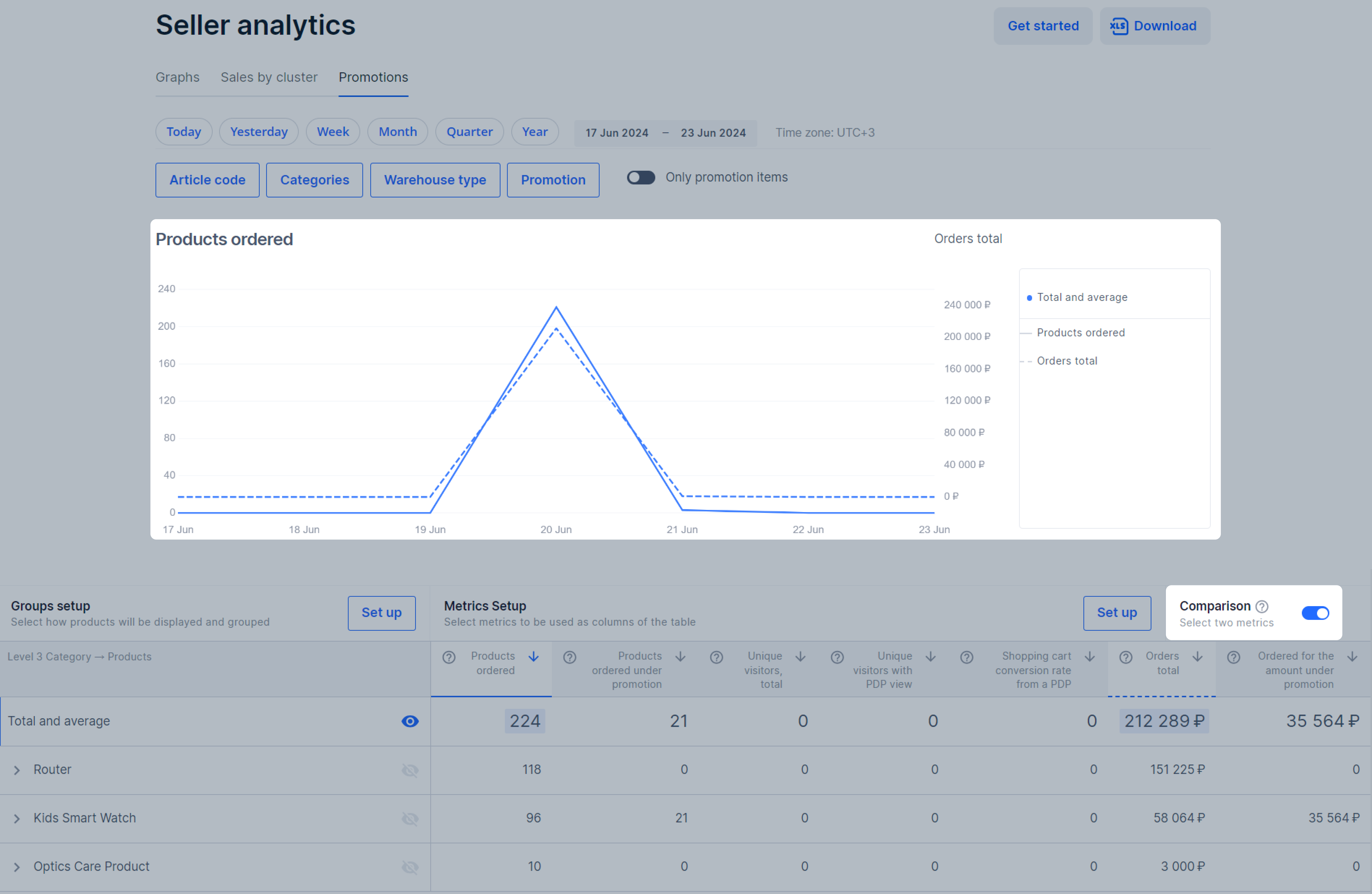
“Only promotional items” switch to view analytics only for products that participated in promotions. By default, the graph displays general analytics for all products. You’ll be able to compare how products that participate and don’t participate in sales are sold during promotions.
Graph—hover over it to view the total and average number of orders per day and find out the difference from the previous one.
Promotions calendar to view which promotions you participated in and their terms. To view the card with the mechanics details and special offers, hover over the promotion row.
Metrics—select four basic metrics that will be shown on the graph:
You can use the additional settings to:
Additional settings include:
Extended report period—view the data for the year or set up an individual period in the calendar.
Additional filter by SKU—manually select one or more products by their Ozon SKU.
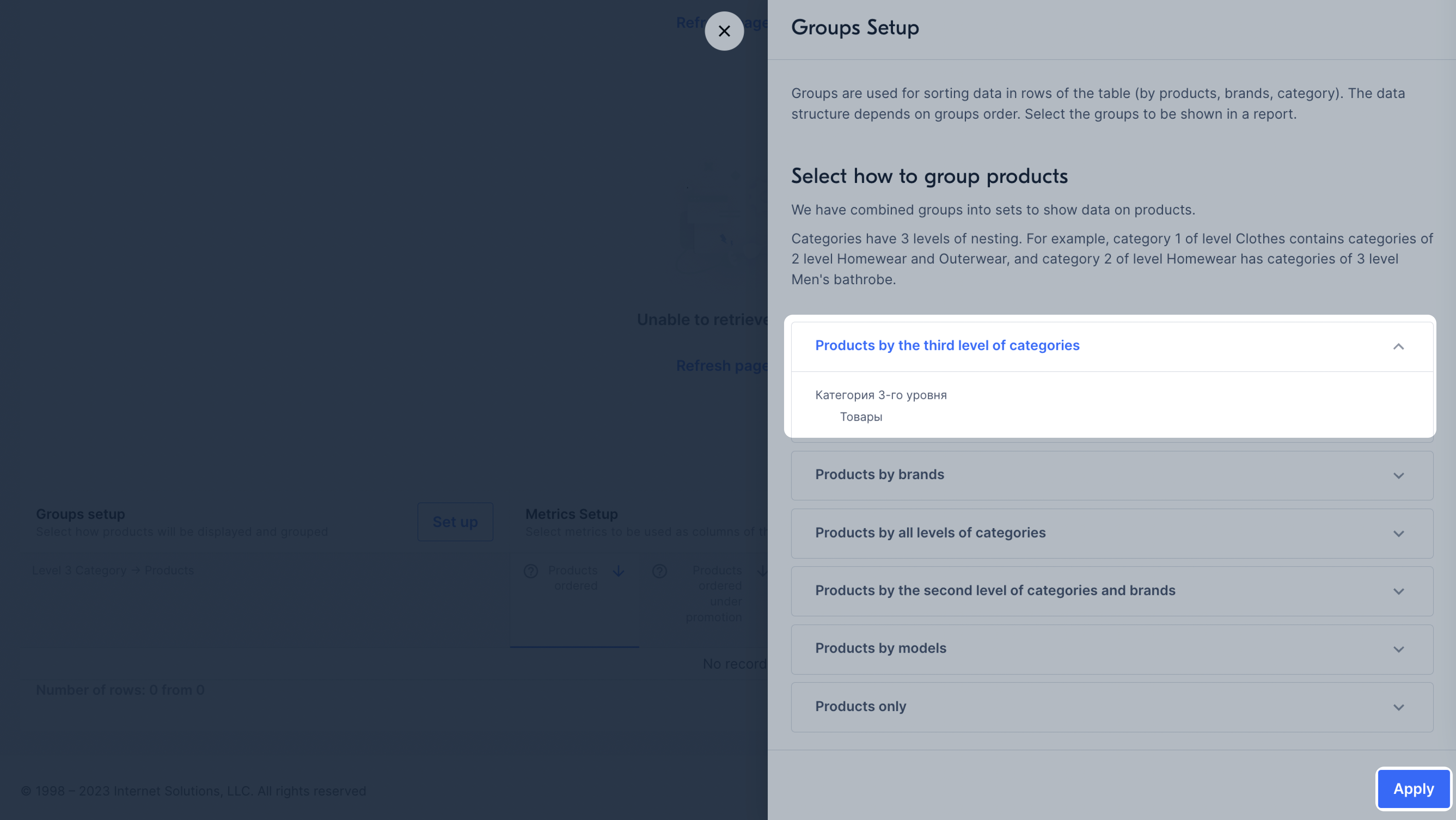
Groupings—select how products will be displayed on the graph: by category, brand, or model.
How to set up groupings
Metrics—select additional metrics that will be displayed on the graph: the number of canceled and returned
products, PDP visitors, conversion.
How to set up metrics
Comparison of metrics—compare the two metrics.
Export—download the data to your computer in XLSX format by days or in a variant set up in your account.

Data is shown on the graph in groupings:
In the lower left corner of the graph, in the Grouping setup block, click Set up.
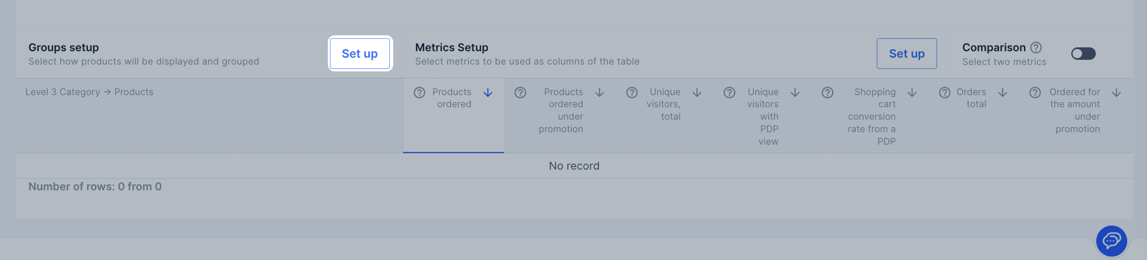
Click the necessary grouping and view how the data will be displayed.
Select a grouping and click Apply.
By default, the graph displays the Total and average field values. You can add data for other
groups, categories, models or products. To do this, click
![]() next to its name.
To hide it, click the icon again.
next to its name.
To hide it, click the icon again.
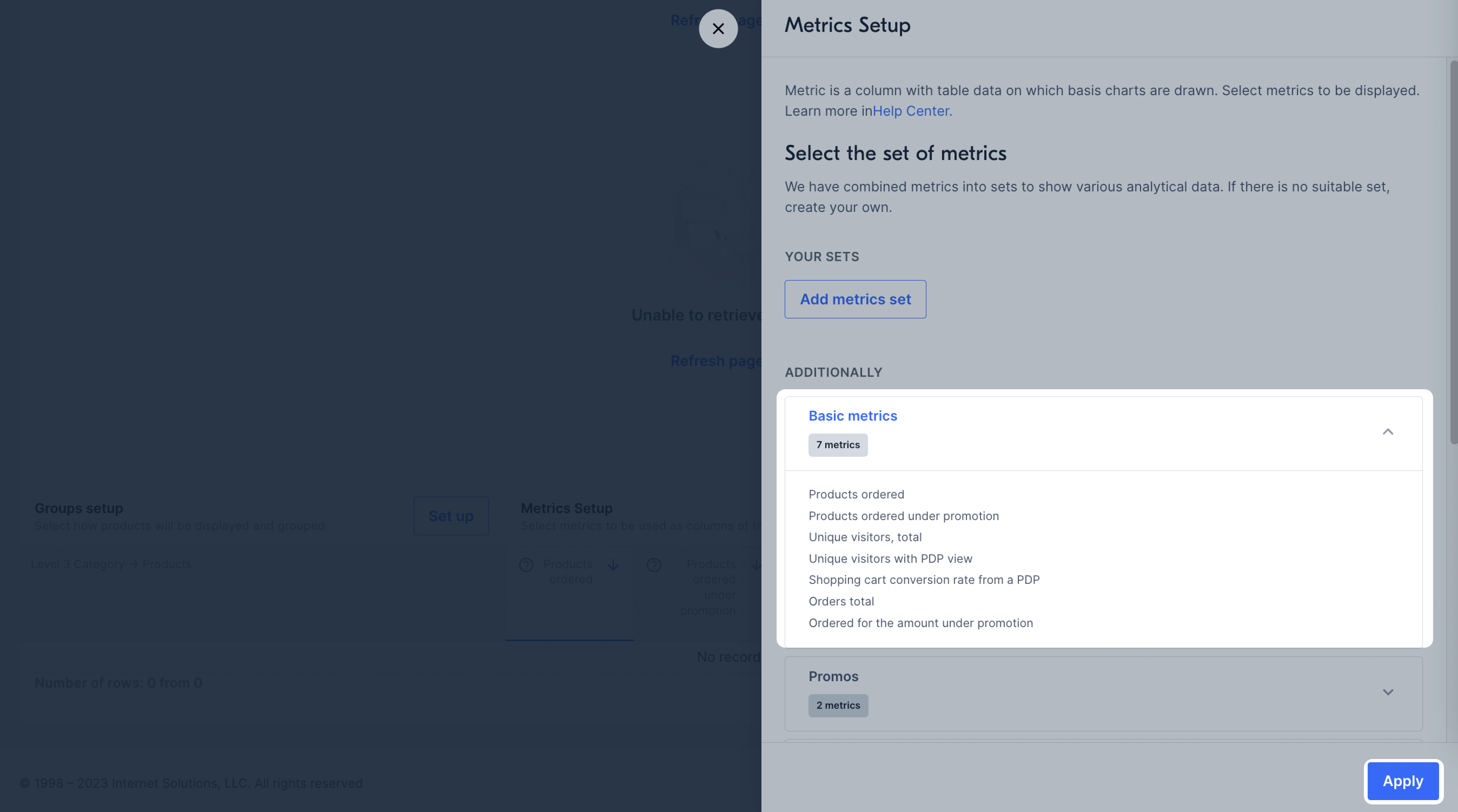
Metrics show the data that will be displayed in the table and on the graph for each product. They are combined into ready-made sets:
You can select sets of metrics for promotions:
By default, a set of “Basic metrics” is shown in the Metrics setion, and the graph is based on the “Ordered products” metric. To display another metric on the graph, click its name.
To add another set to the page:
In the lower right corner of the graph in the Metrics setup block, click Set up.
Select a set of metrics and click Apply.
You can create your own set if the pre-made ones don’t meet your needs:
In the Metrics setup block, click Set up.
Click Add metrics set.
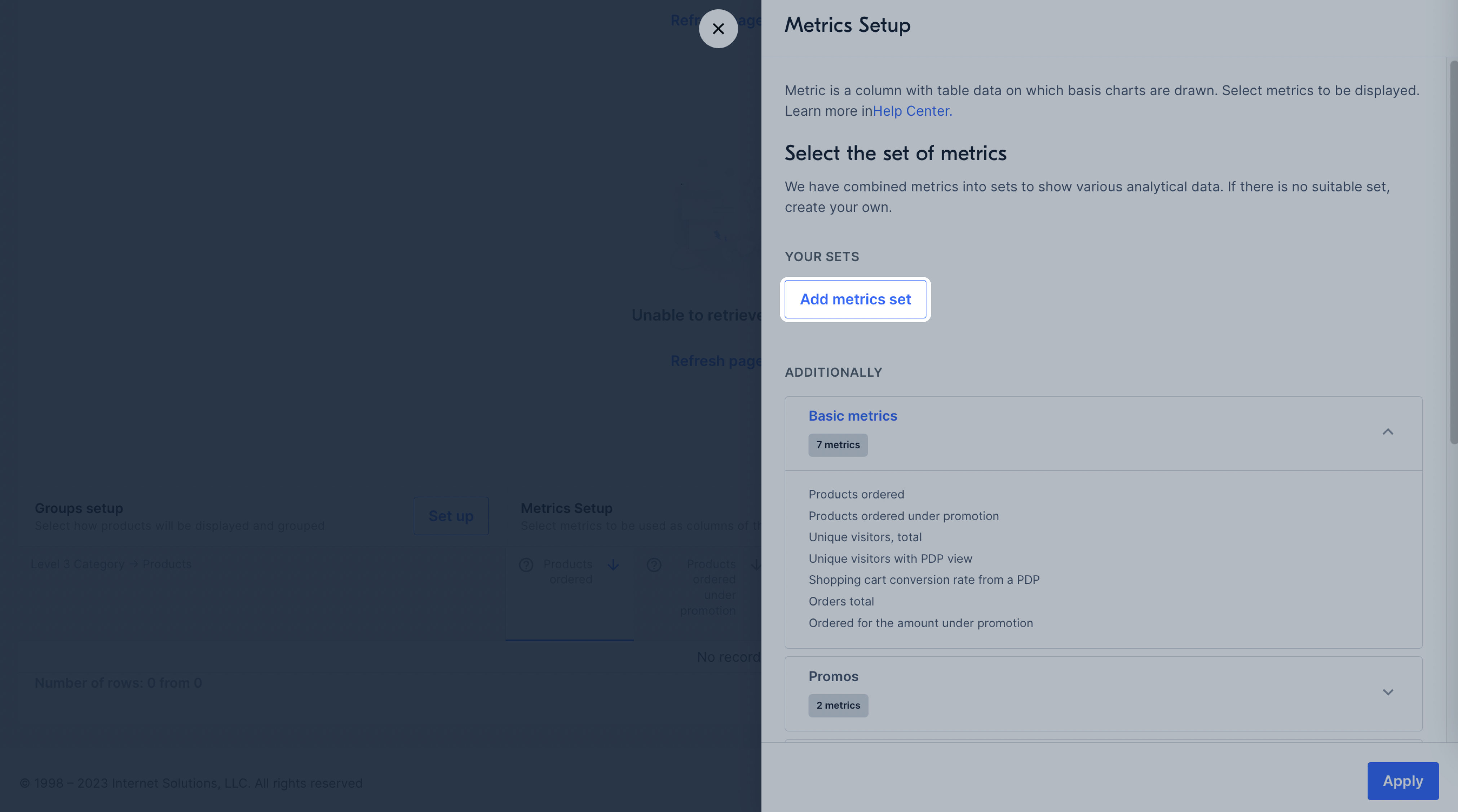
Enter the set name, select metrics, and click Save.
The selected metrics will be displayed on the graph.
To sort the metric values in descending or ascending order, click
![]() next to its name.
next to its name.
You can compare two metrics on a graph. To do this, in the Comparison block, select
![]() and click the names of the
two metrics. By default, the first metric for comparison is Ordered products. To select the second one, hover over its name
and click Compare. The new metric will be displayed on the graph as a dotted line.
and click the names of the
two metrics. By default, the first metric for comparison is Ordered products. To select the second one, hover over its name
and click Compare. The new metric will be displayed on the graph as a dotted line.
To hide a metric, hover over its name and click Remove from comparison.
On the graph, you can compare the total number of products ordered and the number of products ordered under the promotion.
Hide menu
Show menu
Выберите договор

Это база знаний для продавцов из стран СНГ и дальнего зарубежья.
Если ваша компания зарегистрирована в России, перейдите в базу знаний для продавцов из России.
Когда вы зарегистрировались на Ozon?
Условия работы и инструкции зависят от даты заключения договора — её можно посмотреть в разделе Договоры
Определили ваш договор
Он заключён с ООО «Интернет Решения». Если есть другой договор, сможете переключиться на него в боковом меню