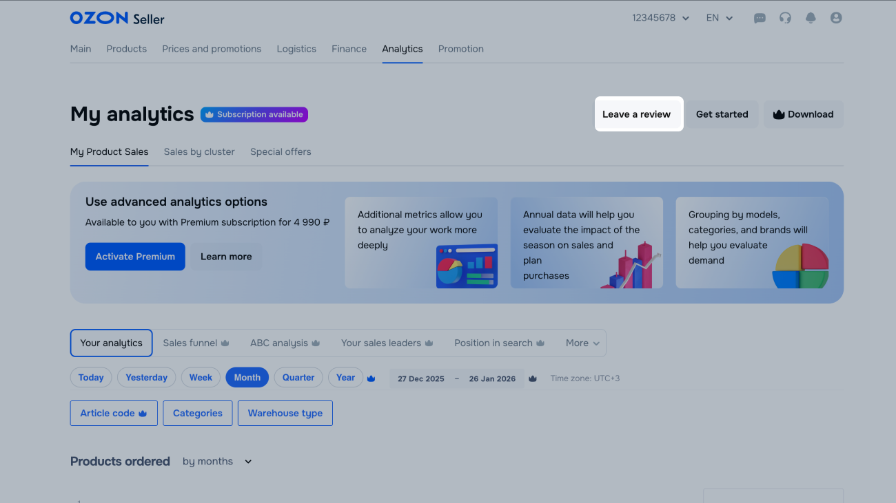
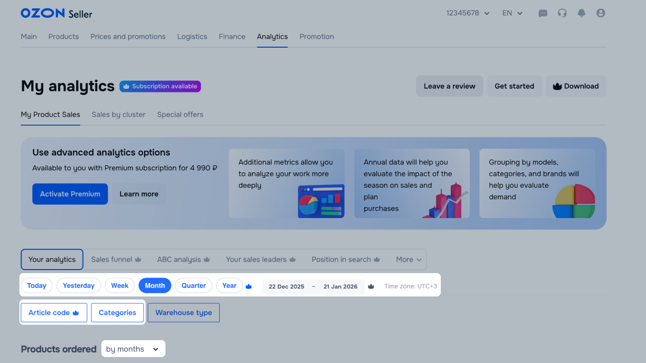
Graphs is a tool for viewing statistics on sales and impressions of your products.
Using graphs, you can create reports on products or a product category for a certain period.
To create graphs, use ready-made metric sets or create your own ones.
Get access to graphs
Advanced analytics is available with the Premium subscription for 2 employees with the “Analyst” role. A “Manager” can assign it in addition to another role.
Learn more about user management
To get unlimited access for all employees, sign up for the Premium Plus subscription.
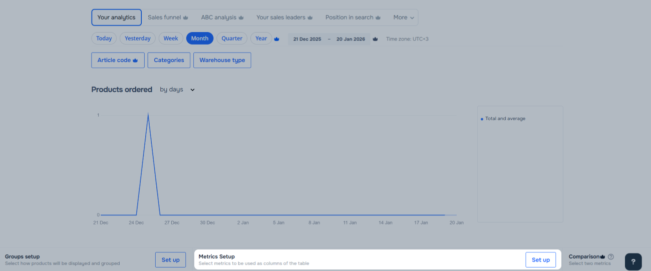
Basic graph settings
- Reporting period: data for today, yesterday, week, month, or quarter.
- Filters. Sales statistics of products with specific characteristics:
- categories: category sales statistics.
- warehouse type: statistics on product sales from Ozon warehouses, seller warehouses, and delivery from abroad.
- Graph details: detailed statistics by days, weeks, and months.
- Graph: hover over the graph to view the metrics for a specific day and the difference from the previous one.
- Metrics: the number and total cost of orders for a specific period.
- Quick access to key metrics on the main page: data is displayed for 14 days. For a specific day, you can view the total number of orders and how many of them have been delivered. The total number of orders includes those that have not yet been delivered. The metrics are displayed in the form of data for the day of order shipment.
Premium subscription graph settings
- Extended reporting period: data for the year, flexible period settings.
- Additional filter by article code.
- Groupings: product sorting in the graph by categories, brands, models.
- Metrics: additional metrics, such as the number of canceled and returned products, product page visitors, and conversions.
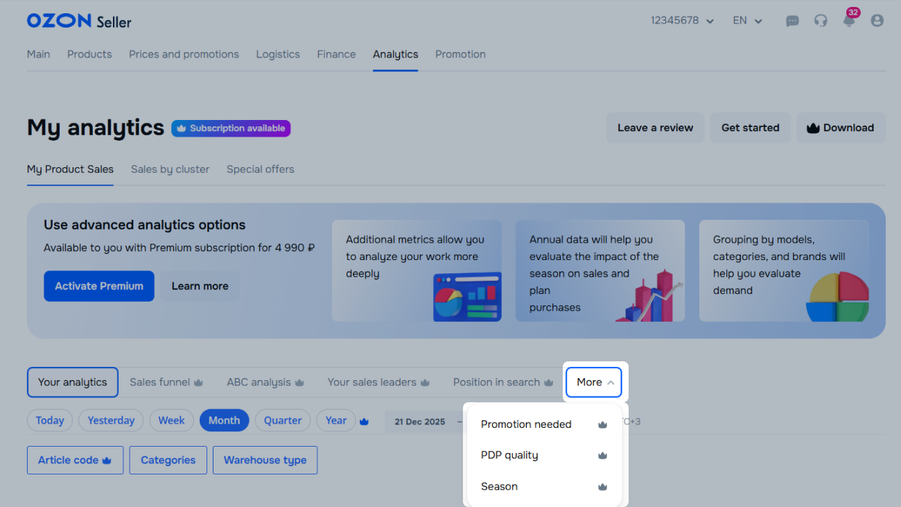
How to create a set of metrics
- Metric selections: detailed information about products. For example, the need for promotion or stages of highest customer loss.
- Metric comparison: compare 2 metrics for products.
How to compare metrics
- Download: the report in XLSX format with the option to break data down by days.
- Additional reporting periods in the graph on the main page: the ordered and delivered products for the current week, the last 7 or 28 days.
- Recommendations: recommendations to increase sales.
How we select recommendations
- Comparison with competitors: we compare the metrics of your product with those of your competitor products.
Learn more about the metrics we compare
Metrics
Metrics are quantitative indicators of sales, impressions, and conversions.
There are several metric types depending on their purpose.
Types
These metrics show data on unique visitors who saw your product or viewed the PDP. This set includes the following metrics:
- Unique visitors, total: the number of unique visitors who saw your product on any website page.
- Unique visitors with PDP view: the number of unique visitors who viewed your PDP.
- Unique visitors with search or catalog views: the number of unique visitors who saw your product in search results or in the catalog.
This set includes the following metrics:
- Impressions, total: the number of times your product appeared on any website pages. This metric increases if a customer sees the product several times.
- Impressions in search and catalog.
- Impressions on the PDP.
- Position in search and catalog: average position of the product in search results and in the catalog. We take into account the position your product takes after all filters and sorting are applied. The position isn’t included in the metric if the customer didn’t see the product. The higher the value, the lower the product appears in search results. The “0” value means that customers didn’t see the product during the selected period.
These metrics help you determine how many unique visitors viewed the product and then added it to the cart. This set includes the following metrics:
- Conversion to cart, total: the ratio of the number of times the product was added to the cart to the number of unique visitors who viewed the product on any website page.
- Shopping cart conversion rate from a PDP: the ratio of the number of times the product was added to the cart to the number of unique visitors who viewed the PDP.
- Conversion to cart from search or catalog: the ratio of the number of times the product was added to the cart to the number of unique visitors who viewed the PDP in search results and in the catalog.
These metrics show how many times customers added your product to the cart from different website pages. This set includes the following metrics:
- Added to cart, total.
- Added to cart from PDP.
- To the cart from search or catalog.
Metrics in this set show data on products in different statuses. You can track the number of canceled or returned products and improve these metrics. This set includes the following metrics:
- Products ordered: total number of ordered and paid products, including returned and canceled ones.
- Products canceled: total number of canceled products regardless of the reason. We take into account cancellations both by the seller and the customer. Data is grouped by cancellation date.
- Delivered (for the selected period): the total number of products delivered during the selected period. It’s included in the data for the day of delivery.
- Redeemed (from those ordered for the selected period): the total number of purchased products that were ordered during the selected period. It’s included in the data for the day the order is placed.
- Products returned: the total number of returned products. Data is grouped by the date when the refund was approved.
Orders total: the total cost of products ordered during the selected period.
Ready-made sets
Similarly themed metrics are combined into sets to help you quickly analyze your sales.
For example, you can track which products sell best, how effective the promotions are, or at which stage of the sales funnel the potential customers most often leave.
Metrics included in the set:
- Products ordered.
- Unique visitors, total.
- Unique visitors with PDP view.
- Shopping cart conversion rate from a PDP.
- Orders total.
- Products canceled.
- Products returned.
- Position in search and catalog.
The graph is based on the monthly Products ordered metric.
The data in the table is grouped into the Level 3 Category → Products set.
This set helps you analyze the user roadmap from searching for a product to ordering it. To track at which stage you most often lose the potential customers:
- See what percentage of potential customers moves from one stage of purchasing a product to another.
- Determine which stages have the lowest percentage of transitions.
Metrics included in the set:
- Impressions in search and catalog.
- Impressions on the PDP.
- Added to cart from PDP.
- Products ordered.
- Orders total.
The graph is based on the monthly Products ordered metric.
Data in the table is grouped by product.
The set shows which products bring the most orders and profit, and which ones have lower sales.
ABC analysis helps determine which products you can promote and restock, and which ones you can replace with more profitable options.
Report contains the following data:
- Category A: valuable products that bring most of the profit or ordered most often. Restock and promote such products to attract more customers.
- Category B: products with average metrics. Such products help you maintain the profit amount and the number of orders when category A products run out of stock. Such products can move to category A if you promote them or improve their quality or PDP.
- Category C: products that bring the least profit. They may have low sales or frequent returns due to poor quality. To increase sales, promote the products if you never tried it before, or improve their quality if you’re a manufacturer.
Seasonality can affect the profit amount and the number of orders. The products that are just launched will always fall into the category C because they have a low number of orders.
Metrics included in the set:
- Products ordered.
- ABC by orders: the products that customers order most often fall into the category A.
- Orders total.
- ABC by turnover: the products that bring the most profit fall into the category A.
The graph is based on the monthly Products ordered metric.
Data in the table is grouped by product.
This set contains data on the products that customers bought most often in the last 7 days. Using this set, you can:
- track the changes in sales of the five most popular products over the last 7 days;
- decide which products to promote in order to maintain high level of sales.
Metrics included in the set:
- Products ordered.
- Orders total.
The graph is based on the monthly Products ordered metric for the five most popular products.
Data in the table is grouped by product.
This set helps you analyze how the position in search results affects your product sales.
As a rule, products that appear lower in search results sell worse. Use this set to:
- Determine which products can become sales leaders. Such products have low position in search results and a high number of orders. Additional promotion helps to raise such products in search results and increase sales.
- Determine which products appear higher in search results and have low sales, and improve their PDPs and quality.
Metrics included in the set:
- Impressions in search and catalog.
- Position in search and catalog.
- Products ordered.
The graph is based on the monthly Position in search and catalog and Products ordered metrics for the most ordered products.
Data in the table is grouped by product.
This set helps you find products with a large number of clicks on the PDP and a high conversion rate from PDP to the cart.
Additional promotion can make such products more visible for potential customers.
Metrics included in the set:
- Position in search and catalog.
- Unique visitors, total.
- Unique visitors with PDP view.
- Shopping cart conversion rate from a PDP.
- Products ordered.
The graph is based on the monthly Unique visitors, total metric.
Data in the table is grouped by product.
This set shows how many customers view the PDP and then add the product to the cart and place an order.
If the conversion rate to the cart is low, improve the PDP to attract customers.
Metrics included in the set:
- Unique visitors with PDP view.
- Shopping cart conversion rate from a PDP.
- Products ordered.
- Orders total.
The graph is based on the monthly Unique visitors with PDP view and Products ordered metrics of the most ordered product.
Data in the table is grouped by product.
This set helps you determine the months with the highest and lowest demand and plan the purchase or supply of products in advance.
Metrics included in the set:
- Products ordered.
- Orders total.
The graph is based on the yearly Products ordered metric and is broken down by month.
The data in the table is grouped into the Level 3 Category → Products set.
If you can’t find a suitable set among the ready-made ones, create your own set.
Create a set
- In the Analytics → My product sales → Metrics setup section, click Set up.
- Click Add metrics set and enter the set name.
- Select up to 14 metrics you want to add to the set. The metrics are displayed in the table in the order you selected them.
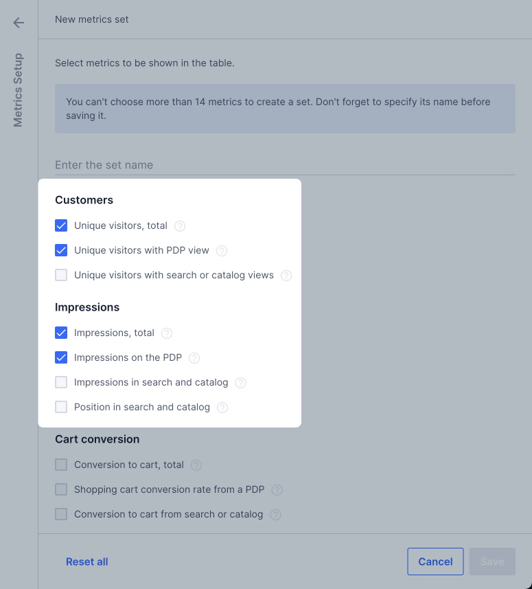
- Click Save.
Add your set to ready-made ones
If you think that other sellers might find your set useful, suggest adding it to the ready-made sets. Click Leave a review and specify which metrics you want to include in the set.
Create a graph
- Go to the Analytics → My product sales section. You can create a graph:
-
based on a ready-made set of metrics: select it on the page;
-
based on your custom set of metrics: in the Metrics Setup section, click Set up, select the set you’ve created, and click Apply.
- Set up the data display:
- select the period for which you want to view the data;
- filter the data by category and article code;
- set the data display step: by days, weeks, or months.
-
In the table, click the metric you want to base the graph on.
-
Select the product groups to display in the table: in the Groups setup section, click Set up. Select a group and click Apply.
Types of product groups
- Products by the third level of categories: the graph displays data on third-level products. For example, the “Women’s Sweater” product falls into the third category, “Women’s clothing” is the second-level category, and “Clothing” is the first-level category.
- Products by brands: the graph displays data on products grouped by brand.
- Products at all levels of categories: the graph displays data on products grouped by first level categories. Expand them to see the nested subcategories and products.
- Products by the second level of categories and brands: products are grouped by second-level categories with nested brands and products.
- Products by models: products are grouped by model.
- Products only: each product is displayed separately.
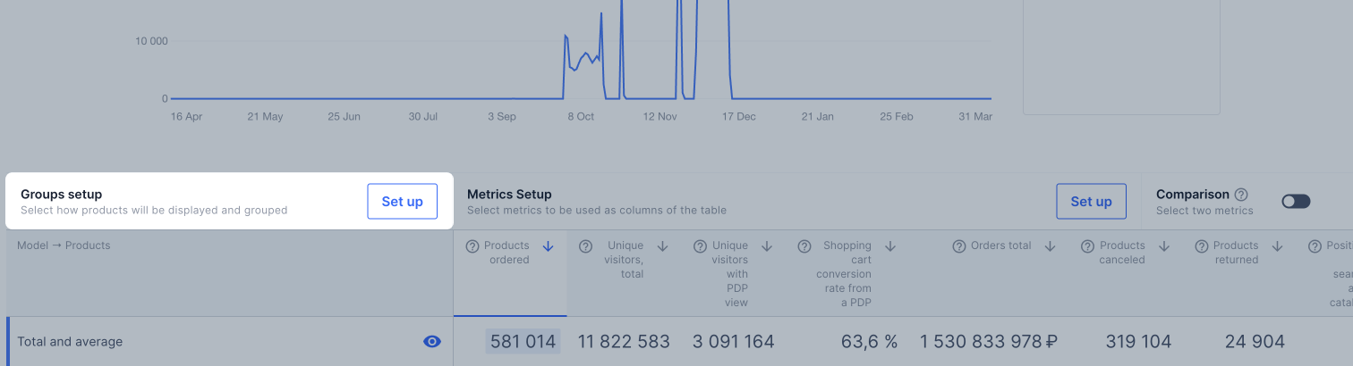
By default, the graph displays the values from the Total and average row of the table. To display data from other rows in the graph, click
 next to the category name.
Hover over the graph to view metrics for a certain day and see how they differ from the previous day.
next to the category name.
Hover over the graph to view metrics for a certain day and see how they differ from the previous day.
Metrics data is updated every hour.
Compare metrics
To compare two metrics in the graph, toggle to Comparison above the table.
The metric that the graph is based on is selected for comparison by default. To select a metric to compare it with, hover over its name and click Compare. It’s displayed as a dotted line in the graph.
To remove a metric from comparison, hover over its name and click Remove from comparison.
Product recommendation selection
For each product, we show the highest priority recommendation.

If you follow the recommendation and your metrics match those of your competitors, the recommendation changes or disappears.
Recommendation selection logic:
| Priority level |
Recommendation |
Recommendation reason |
| 1 |
Add to promotions |
Your product doesn’t participate in the Elastic Boosting promotion. |
| 2 |
Increase the discount |
• The product discount is lower than that of competitors.
• Price index is unfavorable or moderate.
Learn more about the price index
• The values of the Total impressions and Impression-to-order conversion metrics are lower than those of competitors. However, the product is promoted via pay-per-click and its A to S ratio is not lower than that of competitors. |
| 3 |
Enable promotion |
Your product doesn’t participate in the pay-per-click promotion.
Learn more about the promotion |
| 4 |
Increase the A to S ratio |
• Advertising-to-sales ratio is below the competitor metric.
• Total impressions are lower than those of competitors. However, the pay-per-click promotion is enabled for the product.
• Promotion turnover share is lower than that of competitors. However, the pay-per-click promotion is enabled for the product, and it has participated in a promotion this week.
• Days with promotion are fewer than those of competitors.
There is  next to these values. next to these values. |
Comparison with competitors
We compare the metrics of your product with those of your competitor products. If the average competitor metrics are higher than yours, we show next to the value in the table. Hover over it to view details.

The metrics in the table that we compare with those of competitors:
- Days in promotions: how many days the product participated in promotions in the selected period.
- Discount from your price: an average discount on all sold products from your price before promotions.
- Promotion turnover share: the ratio of the product value ordered during the promotion period to the total value of all products ordered during the same period.
- Ordered via promotions: the cost of products ordered during the promotion period.
- Impressions total: the number of impressions on all website pages.
- Impression-to-order conversion: the ratio of the number of orders to the number of product impressions on all website pages.
- Advertising-to-sales ratio (A to S ratio): the percentage ratio of promotion expenses to the cost of products sold.
- Days with promotion (pay-per-click): the number of days over the period when paid promotion in search via pay-per-click was enabled.
Competitor products for analysis
-
We take all the products that fall into the category and price segment of your product.
-
We sort them by Orders total.
-
We group them by the total order amount:
- leader;
- top 1%;
- top 10%;
- top 50%;
- less than 50%.
-
We determine what group your product belongs to.
-
We compare your key metrics with the average values in the refernce group:
| Your group |
Reference group |
| Less than 50% |
Top 50% |
| Top 50% |
Top 10% |
| Top 10% |
Top 1% |
| Leader |
Top 1% |
If your product had no sales, we compare its metrics using the same logic, but the sorting by groups is only within the category.
We show how your metrics differ from those of competitors who sell more than you in the category.
Download a report
Click Download and select the report type: for a period or by days.
The report for a period contains general data without breaking it down by day. Report by days contains data on each day of the period. As the report by days takes longer to generate, we don’t recommend choosing it for a period longer than two weeks.
To view the list of generated reports and their statuses, click Download → Open Download Manager.
You can download the report from the download manager later.
If an error occurs while generating the report, download it later.
The report is stored in the download manager for 90 days.